Empty States and Illustrations
- Home
- /
- Empty States and Illustrations

CREATE AN IMPROVED USER EXPERIENCE WITH EMPTY STATES AND ILLUSTRATIONS.
The first and foremost thing in the digital realm is User Experience (UX). Empty States & Illustrations for UX: While many believe user centric design means designing everything considering the users, they often forget about empty states and illustrations. When properly designed, these elements can greatly improve a users experience when interacting with an application or website. This article examines what empty states are all about, how illustrations could make them better and a guide for including this element in your design practice.
What Are Empty States?
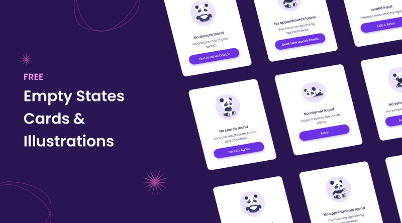
Empty states are the areas on your apps/website where there is no data to show users. These are manifested in many situations like,
The state where a user newly installs an app, and has no data in it yet.
For when a user deletes all data in one area.
If data is not load successfully.
Empty states present an opportunity to interact with our users, direct them on the next steps they should be taking and offer a moment of delight in what is otherwise empty space.
Use of Images in EMpty States
Empty states illustrations accomplish multiple goals;
Empty space:
It fills in empty spaces, making them more visually appealing and less intimidating.
Communication – Illustrations can communicate ideas faster and with more impact than text.
Custom Illustrations that reflect your Brand Personality. Custom drawings also can help show off the character and tone of a brand in an enjoyable manner
User Guidance – They would provide guidance to the users on how they can fill this empty state, could be hints or steps.
Design best practices for Empty states with illustration
Be clear and concise: Reduce the overall tl;dr effect in your content. Do not pack all the information in empty state. A simple concept combined with a short message can work beautifully.
Commitment – Ensure your analysis matches the look and feel of all accompanying application or website materials This helps in creating a strong brand identity, and ensures consistent experience.
Recommended uses:
Use the empty state for two things – to guide users what they need to do and an escape if it is not mandatory. Be sure to followup your written description with an instruction, or a call-to-action (CTA), for users on what they should do next.
This conversely becomes negative reinforcement, frame the empty state from a positive perspective. Rather than emphasizing what data is no longer present, focus on the actions that are available to encourage the user to perform a different function.
Contextual RelevanceIllustration should be relevant to the context of empty state For instance, a pic of a boar with an enormous check referent to the variety might be perfect for an application that is being habitually used as in some tasks app.
When you can:
if appropriate, apply a dash of humor or whimsy in your empty state illustrations. It can make for a fun and memorable user experience.
Effective Empty States Examples
Dropbox:
Dropbox leverages simple and friendly illustrations as well as clear messages to direct users exactly where they should go when uploading files.
Slack provide friendly, casual reminders that align with their colorful brand voice.
Asana :
Features a minimalist illustration that instigates the user to start creating tasks & projects.
Conclusion
Empty States and Illustrations is not what we think as fillers for empty space; they are the golden goose gifted to us on a silver platter. It is these little moments that might be mundane, but you can actually make something of it by adding some visual appeal and a clear line above or below to give the user direction. And we must keep in mind that every interaction counts, and performing a well-designed empty state can have powerful results.
Landing Page UI Kit (Community)
Vector Illustration Design Pack
Free Pulse Illustration Kit 130+ Assets and Scenes
Empty States Kit (7 free templates!)
Healthcare App with Blush Illustrations
Echo Website Hero Header Builder Illustrations Kit
2000+ Free & Premium Vector Illustration
I hope you guys like it!
If you have any query contact us – ITO Digital Agency
- Author: Figma
- Categories: Illustrations
Share
Items you may also like
A UI Design System is a collection of reusable components, patterns, and guidelines that are used to create cohesive and consistent user interfaces. It provides...
In the competitive world of cryptocurrency, a well-designed landing page can be the difference between attracting potential investors and losing their interest. Whether you're launching...
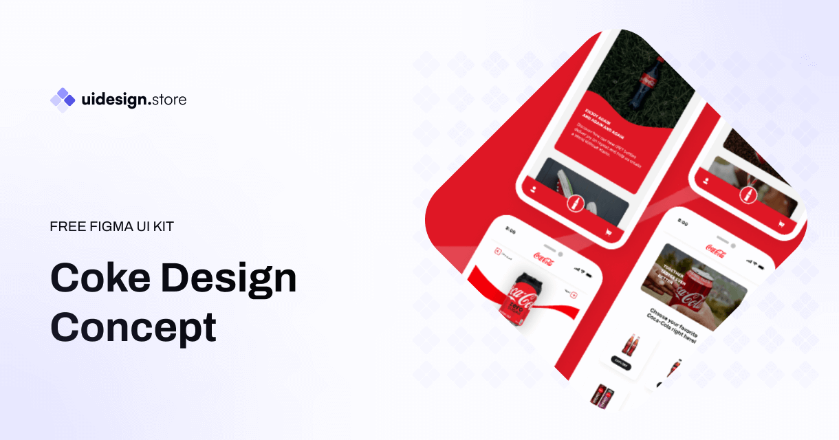
The Coke Design UI Kit is a meticulously crafted collection of UI elements, including buttons, forms, icons, navigation bars, and much more. Developed with a...
The Ultimate Icon Pack: Elevate Your Designs with a Sea of Stylish Icons Icons are the unsung heroes of design. Those tiny visual elements can...
Dynamic Components & Variants: Power Up Your Design System Introduction Designing user interfaces requires efficiency and consistency. But how do you achieve this when projects...
Level Up Your Marketplace & SEO with Stunning 3D Icon Sets In today's digital marketplace, grabbing attention and conveying information quickly is crucial. Here's where...
Building Your Real Estate Empire: The Power of Real Estate SaaS Web and Mobile UI Kits The real estate industry is undergoing a digital revolution....
Dive into the Metaverse: Building Your Dream NFT Marketplace with a Web UI Kit The NFT (Non-Fungible Token) market has exploded in popularity, creating a...
Streamline Your Sales & Marketing: Boost Efficiency with a CRM Dashboard & Landing Page UI Kit In today's competitive business landscape, having a strong Customer...
LInkedin UI Design Kits Free are collections of pre-designed elements, such as buttons, icons, fonts, and color schemes, packaged together to facilitate the creation of...
Redefining Home Decor Shopping: The Power of Mobile Ecommerce
The Rise of Mobile eWallets: Transforming the Way We Pay Convenient and Secure Transactions: Gone are the days of carrying bulky wallets or worrying about...
How the Air Flight UI Kit revolutionizes the flight booking experience, making travel planning a breeze.
The key features and benefits of ZenSocial Dashboard, empowering you to optimize your social media strategy with ease.
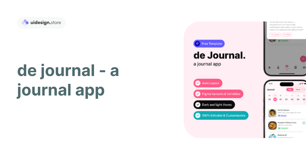
Discover the convenience and power of journaling with our innovative journal app. Organize your thoughts, memories, and goals effortlessly across all your devices. With robust...
In this blog post, we'll explore a free modal upload files kit that includes four distinct modes, each designed to cater to different user needs.
Key Features of Tbean's Profile UI Kits: Customizability: Tbean's Profile UI Kits are designed with flexibility in mind. Developers and designers can easily tailor the...
In conclusion, the Free No-Code SaaS Website UI Kit for Framer and Figma is a game-changer for designers and entrepreneurs looking to create stunning websites...
The Hands Collection isn't just another set of illustrations—it's a meticulously crafted library of 3D models that capture the intricacies and nuances of human hands....


