Finesse UI Figma UI Kit and Design System FREE
- Home
- /
- Finesse UI Figma UI Kit and Design System FREE

The only Finesse UI Figma UI kit and Design System you will need.
Finesse UI Figma UI Kit has been carefully crafted to meet the needs of designers and developers alike, and is suitable for a wide range of projects and applications. Using this, you can save time and effort by starting your design process with pre-built components that can be easily customized to fit your brand and project requirements.
What will you get in FREE version?
1. 1000+ Variants
2. Figma & Sketch Compatibility
3. Multi Shape Components (Square, squircle, etc.)
4. Lifetime Updates Support
5. Auto Layout 4.0 Support
Components Overview
1. Alerts – Informative messages displayed to the user
2. Avatars – Representations of a user or object, often used for identification.
3. Buttons – Clickable elements used to trigger an action or navigate.
4. Toggles – Controls that allow the user to switch between two states.
5. Checkboxes – Controls that allow the user to select one or multiple options.
6. Radio Buttons – Controls that allow the user to select one option from a group.
7. Check Circles – Controls that allow the user to select one or multiple options.
8. Icon Buttons – Buttons containing only an icon to trigger an action on screen.
9. Segmented Controls – Allow the user to switch between different options or views.
10. Inputs – Allow the user to enter data or information.
11. Badges – Indicators used to display a count or status.
12. Tooltips – Small pop-ups that display additional information.
13. Snackbars – Brief messages displayed to the user at the bottom of the screen.
14. Pagination – Navigation elements used to move through a series of content.
15. Breadcrumbs – Navigation elements used to display the user’s current location.
16. Progress Indicators 🔒 – Indicators used to display the status of an ongoing process.
17. Sliders 🔒 – Controls that allow the user to adjust a value by dragging a handle.
18. Dropdowns 🔒 – Allow the user to select an option from a list of choices.
↳ More Updates Coming Soon
Styles Overview
1. Typography – Text styles compatible for all responsive device sizes like Mobile, Tablet, Desktop etc.
2. Color Palette – Minimal Monochrome color palette to following accessibility standards.
3. Shadows – Built to focus on components & different states for each component like Hover, Pressed etc.
4. Icons – Our design system make use of Heroicons which is a collection of 880+ polished and beautiful hand-crafted SVG icons, by the makers of Tailwind CSS.
5. Avatar Images – Our design system uses carefully crafted avatar illustrations from Craftworks
6. Company Logos – The logos are used for illustrative purposes only, and no endorsement or affiliation with the respective companies is implied.
↳ More Updates Coming Soon
👉 Learn more on our website Finesse.website
Show less
I hope you guys like Ui kit!
If you have any query contact us – ITO Digital Agency
Thank You! 🎊
Items you may also like
A UI Design System is a collection of reusable components, patterns, and guidelines that are used to create cohesive and consistent user interfaces. It provides...
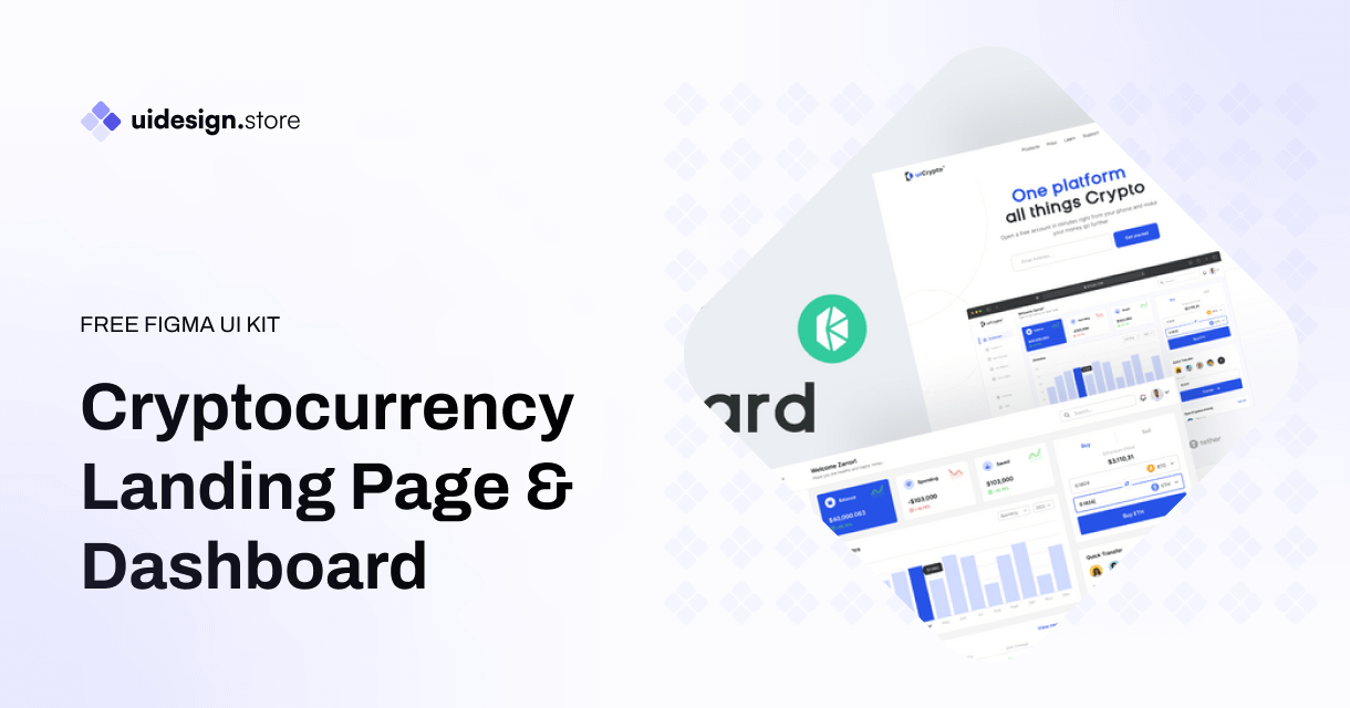
In the competitive world of cryptocurrency, a well-designed landing page can be the difference between attracting potential investors and losing their interest. Whether you're launching...
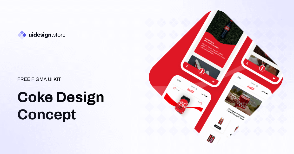
The Coke Design UI Kit is a meticulously crafted collection of UI elements, including buttons, forms, icons, navigation bars, and much more. Developed with a...
The Ultimate Icon Pack: Elevate Your Designs with a Sea of Stylish Icons Icons are the unsung heroes of design. Those tiny visual elements can...
Dynamic Components & Variants: Power Up Your Design System Introduction Designing user interfaces requires efficiency and consistency. But how do you achieve this when projects...
Level Up Your Marketplace & SEO with Stunning 3D Icon Sets In today's digital marketplace, grabbing attention and conveying information quickly is crucial. Here's where...
Building Your Real Estate Empire: The Power of Real Estate SaaS Web and Mobile UI Kits The real estate industry is undergoing a digital revolution....
Dive into the Metaverse: Building Your Dream NFT Marketplace with a Web UI Kit The NFT (Non-Fungible Token) market has exploded in popularity, creating a...
Streamline Your Sales & Marketing: Boost Efficiency with a CRM Dashboard & Landing Page UI Kit In today's competitive business landscape, having a strong Customer...
LInkedin UI Design Kits Free are collections of pre-designed elements, such as buttons, icons, fonts, and color schemes, packaged together to facilitate the creation of...
Redefining Home Decor Shopping: The Power of Mobile Ecommerce
The Rise of Mobile eWallets: Transforming the Way We Pay Convenient and Secure Transactions: Gone are the days of carrying bulky wallets or worrying about...
How the Air Flight UI Kit revolutionizes the flight booking experience, making travel planning a breeze.
The key features and benefits of ZenSocial Dashboard, empowering you to optimize your social media strategy with ease.
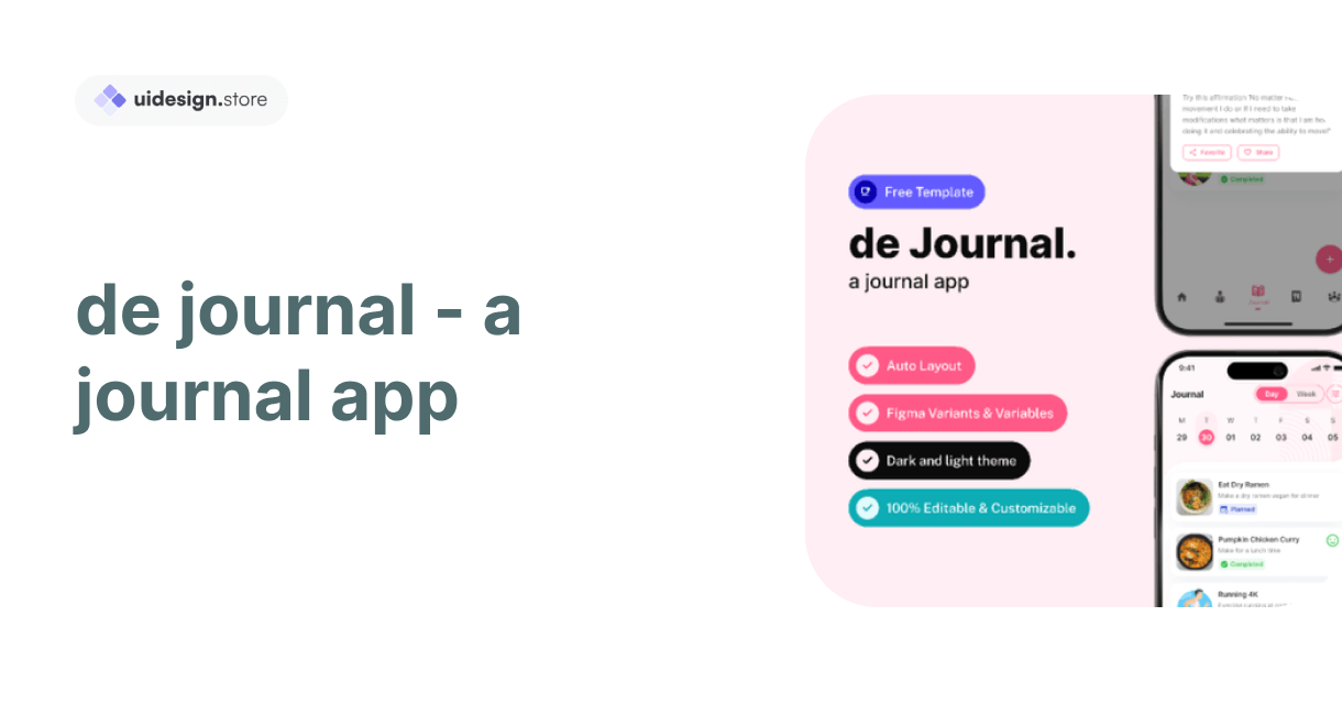
Discover the convenience and power of journaling with our innovative journal app. Organize your thoughts, memories, and goals effortlessly across all your devices. With robust...
In this blog post, we'll explore a free modal upload files kit that includes four distinct modes, each designed to cater to different user needs.
Key Features of Tbean's Profile UI Kits: Customizability: Tbean's Profile UI Kits are designed with flexibility in mind. Developers and designers can easily tailor the...
In conclusion, the Free No-Code SaaS Website UI Kit for Framer and Figma is a game-changer for designers and entrepreneurs looking to create stunning websites...
The Hands Collection isn't just another set of illustrations—it's a meticulously crafted library of 3D models that capture the intricacies and nuances of human hands....


