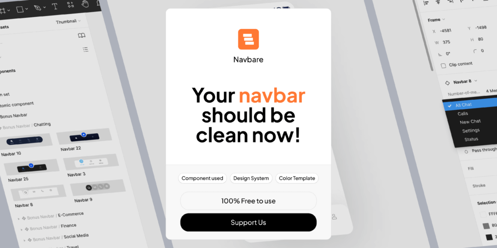
Navbare – Navigation Bar Mobile Apps
- Home
- /
- Navbare – Navigation Bar Mobile Apps

The Navigation Bar is the digital compass to guide users through an app, in an always-growing mobile design world. This unpretentious part is how users interact with your product, allowing for a smooth discovery process where they can effortlessly explore the various features of the app. This blog post will cover everything you need to know about navigation bars in mobile app design – from the essentials, best practices and how it affects user engagement.
User experience basics
Unambiguous Navigation:
A navigation bar, at its core is meant to guide the users within an app. It literally gives a visual road-map, signifying clear and concise options-menu that allows users to easily shift between different sections or functionalities. A well thought out navbar that lacks confusion and allows users instant access to the functionality they want.
Friendly User Interface:
While the user interface (UI) of an app plays a critical role in shaping how easy it is for users to interact with your business, there are certain elements that help build up views. The way it is laid out and where determines a lot about how usable the app will be. For the whole use-case of app users, a well-designed navbar layout gives an exponentially higher user experience and good interactivity to play around with the app more.
Navigation Bar Parts
Hamburger Menu:
You often see this three-line icon – aka the hamburger menu and found in navigation bars. When you click or tap this icon, a hidden menu will hide supplementary navigation options. It is really an space-saving solution that literally brings the second screen features alive without cluttering up of what actually appears want to appear in interface.
Tab Bar – Usually seen in navigation bars, and more specifically at bottom nav patterns Tabs are Sections in the app and Users can navigate between different sections of an App similarly like open tabs. Each of the tabs on that row generally indicates something about which a user might want to do in your app.
The all-important back button – it simply allows the user to navigate backward within your app. They do not make sense in terms of cleanest ability to navigate, especially when digging deeper into app hierarchy.
Search Bar- Its a common practice to include a search bar directly in the navbar, especially for apps which has high amounts of content. This is a very straightforward way for users to search what they want or need from your app on the fly.
Navigation Bar Design Best Practices:
Same Navigation experience:
It is important to keep a same navigation experience in different platforms (example iOS and Android) Those who are familiar with the navigational patterns of one the platforms should not experience any unexpected surprise when progressing to another platform.
Place Several Key Elements:
Make sure top level functions are within the range of an arm (and thumb swipe) away. The important aspects are always easy to reach, either by the main tabs or other big buttons.
Responsive Design:
A responsive navbar is a must in the age of all kinds of screen sizes and orientations. Make sure the navigation bar looks good and works well on all devices, from desktops to smartphones
User Reaction:
Because highlighting the current tab and fading out other tabs will produce a more intuitive navigation experience, we need visual hints / feedbacks such as these. These features provide users a way to view the context under which they are using, as well as see what their interactions have done.
Built with Touch in Mind:
We use mobiles for touch interactions. As a result, designers should take into account touch-friendly design and make sure that the buttons/icons contained in the navbar are big enough to be tapped with different finger sizes.
Evolution of Navbar Designs:
Some of the key features are:Navigational Gestures:
In this era where bezels in smartphones have become a thing from past, navigation gestures is something all we talk about. This approach replaces physical touches to the usual buttons and allows you more screen space. However; the experience of intuitive navigation is still a concern in this dynamic canvas.
Some app designs include a Floating Action Button (FAB) with the navbar. The dynamic element is designed as a quick access to the primary action creating clear visual differentiation and convenient flow how users can accomplish their focus tasks.
Impact on User Engagement:
Less Friction – Well Designed Navigationbars- Most of the user journey would be a bit easier if your navigation bar is well designed. Users can easily move through the app thanks to a consistent and understandable trail, lowering friction (which ends up in frustration or abandonment).
Boosting Discovery:
Simplified Navigation Bar which motivates users to discover different features of the app. The more users trust their ability to move through the app, the farther they will venture into its features — leading to higher user engagement.
Establishing Trust and Retention:
A seamless, regulated navigation experience instills the trust of users. Users are more likely to come back – which is a huge factor in user retention and the creation of brand advocates.
Real-World Examples:
Instagram:
Instagram uses a bottom tab for Home, Search Reels Shop Profile. The main functions of the app have been given priority in this design and it has kept a clear layout for easy understanding.
Twitter:
On Twitter, you have a top navigation bar that contains buttons for Home, Explore, Notifications and Messages. Its design simplicity allows faster access to key functions while scrolling through the timeline.
Conclusion:
The navigation bar is a very important part of user interface design in mobile app. It gives the perfect route for how users visit and use an application conveniently among one another under every peculiar form… A well-crafted navbar transcends mere aesthetics; it affects the functionality, user adoption and ultimate success of your app. In navbar design, designers should focus on clarity, consistency and responsiveness of the user-centric way. The navbar design will always have their place at the heart of guiding users through on digital journey, but like everything else. Therefore, if you are about to undertake your next mobile app design project keep this in mind for a successful UX that fits navigation excellently.
Our Ui Kit :
I hope you guys like it!
If you have any query contact us – ITO Digital Agency
- Author: Maveland Inc.
- Categories: Apps
Share
Items you may also like
A UI Design System is a collection of reusable components, patterns, and guidelines that are used to create cohesive and consistent user interfaces. It provides...
In the competitive world of cryptocurrency, a well-designed landing page can be the difference between attracting potential investors and losing their interest. Whether you're launching...
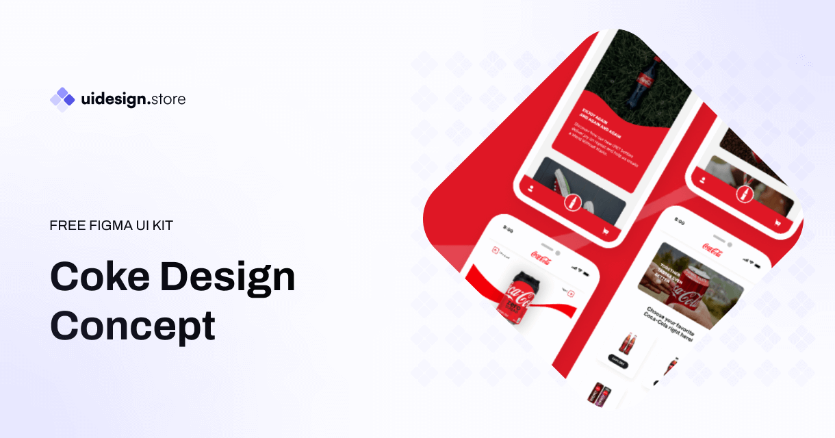
The Coke Design UI Kit is a meticulously crafted collection of UI elements, including buttons, forms, icons, navigation bars, and much more. Developed with a...
The Ultimate Icon Pack: Elevate Your Designs with a Sea of Stylish Icons Icons are the unsung heroes of design. Those tiny visual elements can...
Dynamic Components & Variants: Power Up Your Design System Introduction Designing user interfaces requires efficiency and consistency. But how do you achieve this when projects...
Level Up Your Marketplace & SEO with Stunning 3D Icon Sets In today's digital marketplace, grabbing attention and conveying information quickly is crucial. Here's where...
Building Your Real Estate Empire: The Power of Real Estate SaaS Web and Mobile UI Kits The real estate industry is undergoing a digital revolution....
Dive into the Metaverse: Building Your Dream NFT Marketplace with a Web UI Kit The NFT (Non-Fungible Token) market has exploded in popularity, creating a...
Streamline Your Sales & Marketing: Boost Efficiency with a CRM Dashboard & Landing Page UI Kit In today's competitive business landscape, having a strong Customer...
LInkedin UI Design Kits Free are collections of pre-designed elements, such as buttons, icons, fonts, and color schemes, packaged together to facilitate the creation of...
Redefining Home Decor Shopping: The Power of Mobile Ecommerce
The Rise of Mobile eWallets: Transforming the Way We Pay Convenient and Secure Transactions: Gone are the days of carrying bulky wallets or worrying about...
How the Air Flight UI Kit revolutionizes the flight booking experience, making travel planning a breeze.
The key features and benefits of ZenSocial Dashboard, empowering you to optimize your social media strategy with ease.
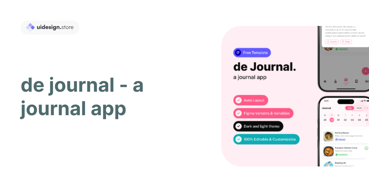
Discover the convenience and power of journaling with our innovative journal app. Organize your thoughts, memories, and goals effortlessly across all your devices. With robust...
In this blog post, we'll explore a free modal upload files kit that includes four distinct modes, each designed to cater to different user needs.
Key Features of Tbean's Profile UI Kits: Customizability: Tbean's Profile UI Kits are designed with flexibility in mind. Developers and designers can easily tailor the...
In conclusion, the Free No-Code SaaS Website UI Kit for Framer and Figma is a game-changer for designers and entrepreneurs looking to create stunning websites...
The Hands Collection isn't just another set of illustrations—it's a meticulously crafted library of 3D models that capture the intricacies and nuances of human hands....


